In light of recent events, I have a request for an enhancement, as we had a training session with an air traffic controller today. He said that the correct position report for a compulsory reporting point or aerodrome should be given in distance rather than in minutes, even though in practice it is not uncommon to report it in minutes. In VFRnav you can only define the length of the course line, which I like to use for this, in minutes. Would it be possible to also select NM and/or km as units here?
…that’s funny. Every spring here on the tower at LEJ we have a VFR kickoff briefing with the air traffic controllers.
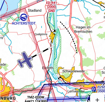
And our controllers prefer time references. After all, as an IL you can quite legitimately enter a CTR without a transponder. They may see you as a point, …but for efficient planning they prefer the time to RPx… but of course in principle it doesn’t matter. Distance in nm is more common, yes.
I actually worked on this feature quite some time ago.
A route-independent distance indicator (NM or km) directly on the map would definitely be very useful.
At the same time, I personally wouldn’t want to do without the current course line – i.e. the one that’s dependent on speed.
The ideal solution would therefore be to be able to display both simultaneously.
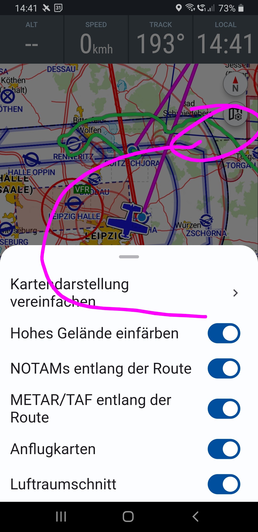
My attempts at the time went in this direction:
So, an arc in the flight direction with a fixed distance.
It’s not perfect yet – but perhaps someone has a good idea or an approach on how it could be sensibly further developed.
I’m uncertain, or rather not convinced about adding such information to the map in addition to the existing data. In principle, a configuration option for this is of course very useful. Perhaps a suggestion would be to expand the basic configuration in the settings. Then just add a selection in the map menu (image).
… and then the question remains: …how do I know what the course line is telling me right now? …there should possibly be an icon of a small clock or a distance meter (km/nm).
A circle: …which then moves along in flight? …potentially overlapping NOTAM circles or Stratux Mode S circles.
Just thinking….
The map should only include information important for the flight… at least that’s what I think.
I agree with Karsten that the complexity should not increase. This can be achieved by allowing these or other features to be switched on or off, so that everyone can determine their own workload.
The layout you showed above, for example, I think is already very good and I would welcome it. If it can be switched on optionally, that would certainly meet Karsten’s requirements.
So, for me, the solution shown above would already be a definite improvement.
→ yes, I actually quite like it now. ??? possibly a small nm or a clock ??? in the middle of the semicircle. That way you can tell what is being displayed.
A fixed distance on the map would be really, really good. But I definitely agree with Hermann: the current course line must not be removed for that. It’s simply too valuable to me while flying.
A full circle around my own position would be enough for me. Nice and subtle